AmigoPOS includes an intuitive drag & drop seating chart designer for creating and managing restaurant floor plans. The seating chart supports multiple rooms, real-time table status tracking, floor statistics, reservations, and waiting list management. Each room layout is stored as a scalable vector design that can be customized with tables, booths, bar counters, decorative elements, and more.
Accessing the Seating Chart
The seating chart can be accessed in two ways:
- New Order: When starting a new dine-in order, the seating chart is displayed so the server can select a table. Tapping an empty table immediately starts a new order. Tapping an occupied table displays the table action panel.
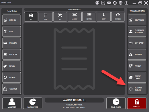
- Manage Tables: Select MANAGE TABLES from the main screen to open the seating chart in management mode. This mode displays the full navigation bar with access to Tables, Reservations, Waiting List, and Designer.
Navigation Bar
When opened in Manage Tables mode, a navigation bar is displayed at the top with the following buttons:
- CANCEL: Closes the seating chart and returns to the main screen.
- TABLES: Displays the floor plan for the selected room. This is the default view.
- RESERVATIONS: Opens the reservations management overlay.
- WAITING LIST: Opens the waiting list management overlay.
- DESIGNER: Enters the floor plan designer. This button is only visible for job types that have the Seating Chart Designer permission enabled.
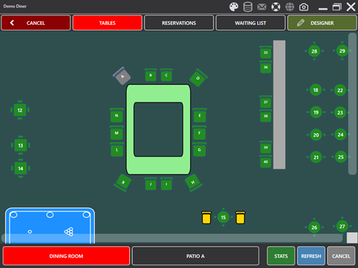
Floor Plan View
The floor plan displays all tables and elements for the selected room. Tables are color-coded to indicate their current status. Tapping a table opens the table action panel where you can start a new order, recall an existing order, settle, split, transfer, void, or change the table status.
Room Selection
The bottom bar displays a scrollable row of room buttons. Tap a room button to switch to that room's floor plan. The currently selected room is highlighted in red. Additional buttons on the bottom bar include:
- STATS: Opens the floor statistics overlay. This button is only visible if the Seating Chart Statistics permission is enabled.
- REFRESH: Reloads the current room data including table statuses and active orders.
- CANCEL: Closes the seating chart.
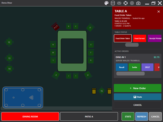
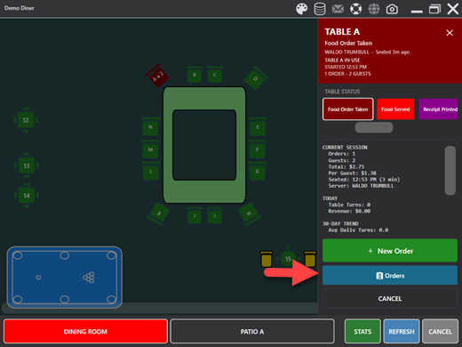
Table Action Panel
When a table is tapped, a panel slides in displaying the table name, current status, and available actions. The panel header color reflects the table's current status. The following actions are available:
- New Order: Starts a new order on the selected table.
- Recall: Opens an existing order for editing.
- Settle: Proceeds to payment for the selected order.
- Split: Splits the selected order into multiple checks.
- Transfer: Transfers the selected order to a different table.
- Void: Voids the selected order.
- Combine: Combines multiple orders on the same table.
- Check In: Marks a guest as checked in.
- Set Status: Changes the table status when table status tracking is enabled.
The panel also displays the number of active orders, total guest count, order total, and time started. If the table has active orders, they are listed with their totals so you can select a specific order to act on.
Table Status
Table status tracking allows you to assign color-coded statuses to each table, providing a visual overview of your floor at a glance. Table statuses are configured in the Designer and can be customized to match your restaurant's workflow.
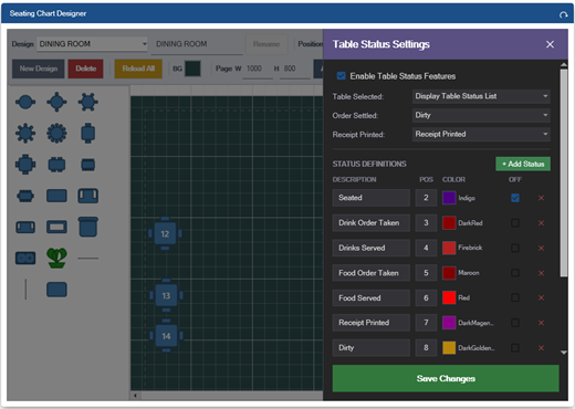
Configuring Table Statuses
To configure table statuses, enter the Designer and click the Table Status button in the toolbar. A panel will appear with the following settings:
- Table Status Enabled: Toggle to enable or disable table status tracking for this room.
- Display Time Elapsed: When enabled, the time elapsed since the last status change is displayed on each table.
- Table Selection Action: Controls what happens when a table is tapped:
- Auto-Start Order: Tapping an empty table immediately starts a new order.
- Show Status Panel: Tapping an empty table opens the action panel where you can set the status or start a new order.
- Status After Payment: Automatically sets the table to the selected status after an order is settled.
- Status After Receipt: Automatically sets the table to the selected status after a receipt is printed.
Status Definitions
Each status has a name and a color. Statuses are displayed as color-coded buttons on the table action panel. When a status is assigned to a table, the table's fill color on the floor plan changes to match. Common status examples include Available (green), Seated (blue), Ordering (yellow), Served (orange), Check Dropped (purple), and Needs Cleaning (gray).
Floor Statistics
The floor statistics overlay provides a real-time summary of restaurant activity. Tap the Stats button on the bottom bar to open the overlay. Statistics include:
- Total tables and tables currently in use
- Total guests seated
- Open orders and total revenue
- Average order value
- Table turnover rate
Tap the overlay background or the close button to dismiss the statistics.
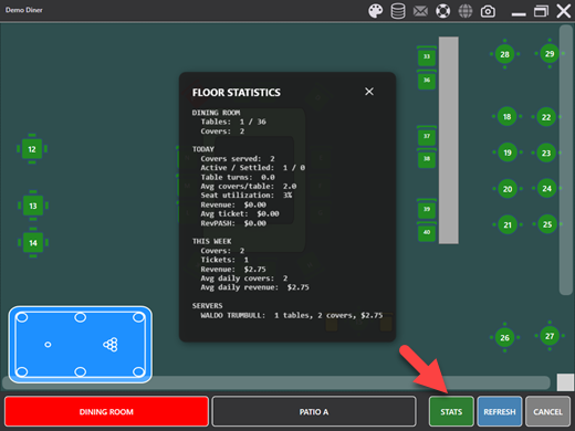
Table Statistics
When a table is selected, a summary line is displayed below the table name showing the number of orders, guest count, order total, and time started. For more detailed statistics, tap the STATS button within the table action panel to view historical performance data for the selected table.
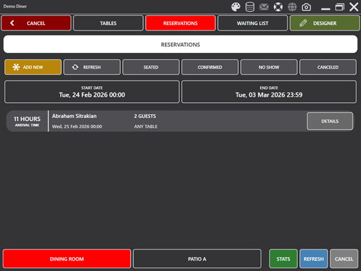
Reservations
The reservations screen allows you to create and manage future dining reservations. Tap RESERVATIONS on the navigation bar to open the reservations overlay.
Reservation List
Reservations are displayed in a scrollable list filtered by date range. Use the date selector at the top to change the start and end dates. Each reservation shows the guest name, party size, reservation date and time, assigned table, and status indicators.
Filter buttons allow you to view all reservations or filter by status: Confirmed, Canceled, or No-Show.
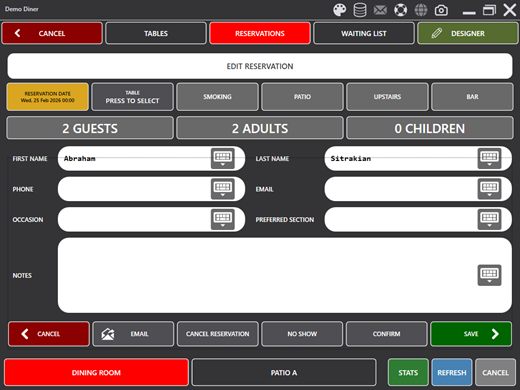
Creating and Editing Reservations
Tap NEW RESERVATION to create a new entry, or tap an existing reservation to edit it. The edit panel includes the following fields:
- First Name / Last Name: Guest name.
- Phone / Email: Contact information for confirmations and reminders.
- Occasion: Special event or occasion (birthday, anniversary, etc.).
- Preferred Section: The guest's preferred seating area.
- Notes: Additional notes or special requests.
- Guests / Adults / Children: Party size breakdown, set using the number pad.
- Reservation Date: The date and time of the reservation.
- Table: Tap to select a table from the floor plan. The seating chart is displayed and you can tap a table to assign it to the reservation. Press CANCEL or the RESERVATIONS navigation button to return without selecting a table.
Reservation Actions
The bottom of the edit panel provides action buttons:
- CANCEL: Discards changes and returns to the reservation list.
- EMAIL: Sends a confirmation email to the guest.
- CANCEL RESERVATION: Marks the reservation as canceled.
- NO-SHOW: Marks the guest as a no-show.
- CHECK-IN: Confirms the guest has arrived and marks the reservation as confirmed.
- SAVE: Saves the reservation and returns to the list.
Up to four custom fields can be configured in settings and used to tag reservations with additional attributes (such as Smoking, Patio, Upstairs, Bar). These appear as toggle buttons above the form fields.
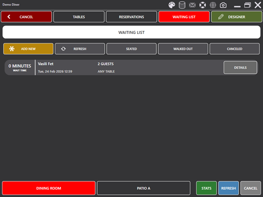
Waiting List
The waiting list operates similarly to reservations but is designed for walk-in guests. Tap WAITING LIST on the navigation bar to open the waiting list overlay.
Waiting list entries are automatically assigned the current date and time. The edit panel is the same as reservations with the following differences:
- The reservation date field is not displayed since the date is always today.
- REMOVE FROM LIST replaces Cancel Reservation. When a waiting list entry is marked as removed and saved, the entry is permanently deleted.
- WALKED OUT replaces No-Show, indicating the guest left before being seated.
Each entry displays a time elapsed indicator showing how long the guest has been waiting, with color coding to highlight long wait times.
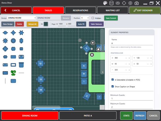
Floor Plan Designer
The floor plan designer allows you to create and edit room layouts using a drag & drop interface. To enter the designer, tap the DESIGNER button on the navigation bar. The button text changes to EXIT DESIGNER while in design mode. The DESIGNER button is only visible for job types that have the Seating Chart Designer permission enabled.
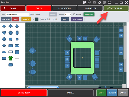
Designer Layout
The designer is divided into three areas:
- Stencil Panel (Left): Contains draggable table and element shapes organized by category. Drag shapes from the stencil onto the canvas to add them to the floor plan.
- Canvas (Center): The design surface where tables and elements are placed. Tables can be dragged to reposition them and resized using the selection handles.
- Properties Panel (Right): Displays properties for the selected element or design-level settings. The panel scrolls vertically to accommodate all properties.
Design Management
The toolbar at the top of the designer provides controls for managing designs:
- Design Selector: A dropdown to switch between saved room designs. Each room can have its own design.
- Design Name: Edit the name and click Rename to update it.
- Save: Saves the current design. The button turns red when there are unsaved changes and returns to green after saving.
- New Design: Creates a new blank design.
- Delete: Deletes the current design after confirmation.
- Table Status: Opens the table status configuration panel.
When switching designs with unsaved changes, you will be prompted to save, discard, or cancel the switch.
Available Shapes
The stencil panel contains the following shape categories:
Tables
- Round Table: A circular table, available in standard and large sizes.
- Square Table: A square table, available in 2-seat and 4-seat configurations.
- Booth: A rectangular booth-style seating element.
- Banquet Table: A long rectangular table for large parties.
Bar & Counter
- Bar Counter (Hollow Bar): A large bar counter shape. Classified as a decorative element by default.
- Bar Stool: An individual bar seat. Classified as a decorative element by default.
Decorative & Structural
- Wall / Vertical Wall: Wall segments for outlining room boundaries.
- Plant: Decorative plant element.
- Host Stand: A host/hostess station.
- Server Station: A server station or POS terminal location.
- Pool Table (Billiards): A billiards table for entertainment areas.
Decorative and structural elements are not selectable by default when starting a new order. This can be changed in the element properties.
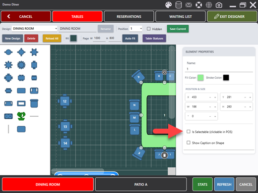
Element Properties
When an element is selected on the canvas, the properties panel displays the following settings:
Position & Size
- X / Y: The horizontal and vertical position of the element on the canvas in pixels.
- W / H: The width and height of the element in pixels.
- Rotation: The rotation angle of the element in degrees.
Table Settings
- Table Name: The name displayed on the table and used on receipts and prep tickets. When a new table is added, a default name is assigned based on the shape type (e.g., "Round Table", "Booth").
- Min Guests: The minimum number of guests normally seated at the table.
- Max Guests: The maximum number of guests. This value is used as the default guest count when starting a new order. For example, a table with Max Guests set to 4 will display "Guest 1 of 4" on the order entry screen.
- Section: The section or area where the table is located (e.g., Main, Patio, Bar). Used for reporting and filtering.
- Selectable: When checked, the table can be tapped to start a new order. Uncheck this for decorative elements such as walls, plants, and fixtures that should not be selectable.
- Accessible: Indicates the table is wheelchair accessible or meets accessibility requirements.
- Show Caption: When checked, the table name is displayed on the element. Uncheck to hide the name for a cleaner appearance on small elements.
Appearance
- Fill Color: The background color of the element. Click the color button to open a color picker. When table status tracking is enabled, the fill color is overridden by the table's current status color during normal operation.
- Stroke Color: The border color of the element.
Canvas Settings
When no element is selected, the properties panel displays design-level canvas settings:
- Page Width: The width of the canvas in pixels. Increase this value to create a wider floor plan. Press Enter after changing the value to apply.
- Page Height: The height of the canvas in pixels. Increase this value to create a taller floor plan. Press Enter after changing the value to apply.
- Auto Size: When clicked, the canvas automatically resizes to fit all elements with appropriate padding. This is useful after placing all tables to remove excess whitespace.
- Button Position: Controls where the room button appears in the bottom bar. Use this to set the display order of rooms.
Saving and Unsaved Changes
Any modification to the design — adding, moving, resizing, or deleting elements, or changing properties — marks the design as having unsaved changes. The Save button changes from green to red to indicate unsaved changes. Click Save to persist the design to the database. If you attempt to switch designs or exit the designer with unsaved changes, you will be prompted to save, discard, or cancel.
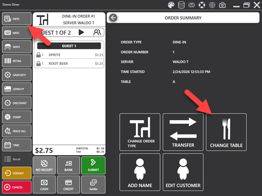
Changing a Table
A table assignment can be changed from two locations:
- Order Entry Screen: Press the CHANGE TABLE button to open the seating chart in table selection mode. Tap the desired table to reassign the order.
- Reservations Edit Panel: Press the TABLE button to open the seating chart. Tap a table to assign it to the reservation. Press CANCEL or tap RESERVATIONS on the navigation bar to return without changing the table.